Pages

Showing posts with label Charts. Show all posts

Thursday, January 11

Portfolio Update: Everything is awesome (for now)…Part I


To supplement the recent portfolio updates on some key positions, OM wanted to talk about his ‘market view’.  He’d normally spare y’all from this but it seems appropriate since the portfolio is the ‘riskiest’ it has ever been.  While OM’s broker’s limited metrics don’t show it, OM thinks of the positions in Brazil, Argentina, Greece and Uranium as being rather correlated and thus the portfolio is riskier.  In addition to the prevalent Emerging Markets risk, all are situations where the broad theme is similar; an element of stress/distress but a combination of fundamental valuation support and catalysts to change investor psychology offer opportunity.  Given the size of these positions, and the risk, Our Man is going to touch on the macro outlook, and then on valuation and psychology to hopefully explain why he’s so comfortable (at the moment).

Macro Outlook
Let’s not bury the lede, as we enter 2018 everything is awesome…


Our Man is a firm believer that recessions and crises don’t come from nowhere, and that there are warning signs for those who are willing to look.  This does not mean that recognizing the warning signs will be easy, and there will be mistakes along the way, but it behooves us to try.  With regards to the US, current data is uniformly rock solid; OM has posted the GDP graph below, but you could look at jobless claims, average hourly earnings, unemployment, inflation, etc. and the story would be the same.  Yes, most of these are lagging/coincident data (i.e. tells us how the economy was/is doing, not how it will do) but there’s no hint of a breakdown.


In terms of forward looking macro data, OM has historically found the Chicago Fed’s National Activity Index to be helpful and timely; it shows no sign of decline.  This is supported by other leading indicators out there such as the St. Louis FED's Leading Index for the US, the Conference Board’s Leading Economic Index and the Philadelphia FED’s state leading indexes.
The best market-based measure for recessions has been the inversion of the yield curve - when long-term Treasury yields are lower than the short-term ones - as it has been an accurate historical forecaster of past recessions.  The US yield curve has been flattening for the last couple of years and it is now at a level last seen before the Great Financial Crisis, which some see as an early warning sign.  However, as the graph below shows, the yield curve has historically inverted well before (i.e. 1-year+) any recession.  Thus, with the yield curve flattening but yet to invert, OM thinks there is more than enough time to enjoy the sunshine.

To summarize, the US continues to enjoy a prolonged spell of economic growth and is enjoying a “beautiful normalization” following the crisis.  What changed in 2017, was that this became a global occurrence; 2017 was the first year since the crisis that the global economy was operating at full potential.  This trend was visible across all regions and different economies, with World GDP growth at 3.0% comfortably outpacing the World Bank’s June expectations (by 0.3%).  Special shout-outs to Japan, which has had its longest growth boom since 1994, and Europe, which has rebounded strongly and where PMI’s suggest continuation in the near-term.

There are legitimate concerns for investors, but for now the economy is not one of them.  EVERYTHING IS AWESOME!!!

[OM will be back with Part II on Valuation and Investor Psychology tomorrow]

Thursday, August 11

Chartology: U-G-L-Y, You ain’t got no alibi!

As some of you may have noticed, despite the attempted rallies, the markets have not been a pretty sight this month!  No doubt, if you’ve had the misfortune of watching the terrible talking heads you’ve no doubt heard it’s all the politicians fault (debt-ceiling muppetry), or S&P’s (how dare they downgrade the US from AAA), or the Europeans (call that a plan for dealing with Greece, Ireland and Portugal and Spain and err Italy), or companies (how dare they say things aren’t as rosy as the talking heads would like) or just the whole world (damn the whole globe for a global slow-down!).  As you know, Our Man believes that markets are far more of a Bak-Tang-Wisenfeld sandpile and when they’re in a “critical state” it only takes one stray grain of sand landing in the wrong spot to bring it all down; thus, there’s little point blaming the particular grain of sand whether it’s European, Global, political, economic or company fundamentals!

Given that, here’s some graphs showing you why (or perhaps, that) we’re in a critical state!

1) Valuation

Look, the CAPE (or Shiller PE10) isn’t perfect and certainly isn’t useful as a timing device but it does provide the single best (and historically tested) look at valuation on a long-term basis.  Forget what you hear about markets being cheap (especially when it’s drivel like based on analyst-projected operating earnings) and suck it up…equity markets have been expensive by historical standards for well over a decade!  If CAPE isn’t your long-term valuation measure of choice, how about Tobin’s Q or Market Cap-to-GDP (Buffet's favourite, apparently).

2) Corporate Fundamentals


(Graph courtesy of Bill Hester, Hussman Funds)

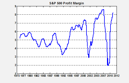
If you want to buy stocks that are not only expensive but whose profit margins are close to their all time highs, then that’s your prerogative.  It’s certainly possible that margins improve and we see record highs, but is that really something you want to bet on.

 3) Signs of Economic Slowdown

Sure, this is just a PMI graph for China and it’s barely crossed into the recessionary (<50) readings but pick a major economy, and this and the leading indicators all look the same.  So far that’s over-valued stocks, with near peak margins and signs of global economies cooling…doesn’t exactly sound like a recipe for success.

4) US Economic Data is pretty either

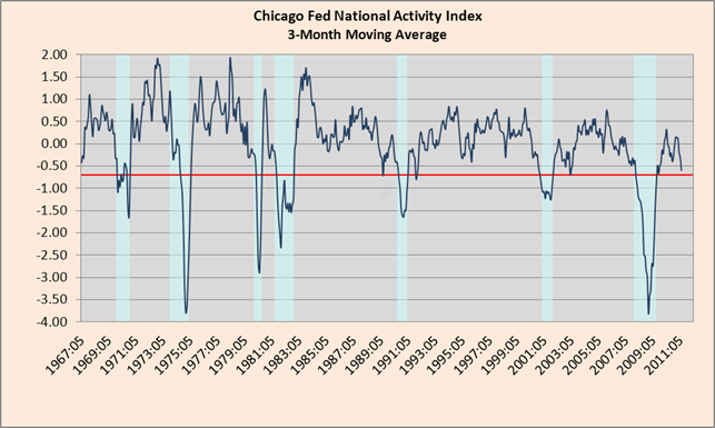
There’s no great way of telling how the economy is doing in real-time, but the Chicago Fed’s National Activity Index is a good start (I’d also point you in the direction of the Philly Fed’s ADS Index .  You’ll notice that they’re not telling a happy tale at the moment with both so far above, but flirting with, recession-like levels (and noticeably worse than 2010’s dalliances).

5) Italian yields have seen better days

The ECB's buying of Italian and Spanish bonds this week has clearly helped lower their yields from the danger levels seen last week, but the risk is that it's coming at the cost of putting France into the firing line.  With the Italian’s having 120% Debt-to-GDP, will France and Germany risk their AAA status (which is vital to the EFSF) to buy Italy time for reform and austerity?  Perhaps, will it work out as well(!) as buying Greece time by bailing it out last year has?  Probably, and that's what should worry you!

6) The Charts
(Courtesy of OEW/Elliott Wave lives on)

Look, Our Man will never profess to be a technical analyst, or to fully appreciate its wares, but he does have a small crush on Objective Elliot Wave analysis, what with its relation to behavioural theory and market psychology and all.  It’s not perfect but given OEW's track record, when it flips from a bull market to bear market (and vice versa) then Our Man thinks you should at least listen (especially since they’ve been suggesting the bull market might be ending since May, with increasing conviction through July).

In conclusion, these are the little things that make a market interesting.  They have been on the brink of a “critical state” for a while now so blaming any one thing is foolish.  Our Man didn’t own much equity before and he sure as hell won’t be using this correction to load-up, and instead will only be nibbling at the odd thing that becomes exceptionally cheap under the security blanket that his puts offer.  What'd it take for OM to load-up?  Well, a good starting point to thinking about having a reasonable equity position would be when valuations were cheap (i.e. CAPE under historical mean) and margins were small; and Our Man would "fill his boots" should he ever see a CAPE near its historical lows and margins near theirs (but we're talking an S&P of c400 for that to happen, so don't hold your breath).  As for everyone else (in the whole wide world), they make their own decisions and that’s what makes a market!

Special Bonus Chart:  That downgrade…
It didn’t seem to cause any immediate spike in Japanese yields!  Interestingly, US yields have also collapsed post-downgrade…not exactly what the talking heads had in mind!  Apparently, inflation (and inflation expectations) & GDP growth (and growth expectations) have more impact on what bond investors do and where yields trade than an S&P rating.  Colour me shocked!

Saturday, March 26

Chartology – March 2011

Here are some charts that have caught Our Man’s beady eye over the recent few weeks:

1) Double Dip in Housing?
The above graph (courtesy of Calculated Risk) shows the Case-Shiller home prices indices starting to turn negative again.  Given that one of the aims (and successes) of QE2 was to influence the economy through the “wealth” effect this should be concerning.  For all the incremental help that a higher equity market offers to some, it’s far overshadowed by the impact of house prices.  Finally free of government stimulus and support, house prices have started to fall once more and if it continues this will have far more serious implications for the economy.


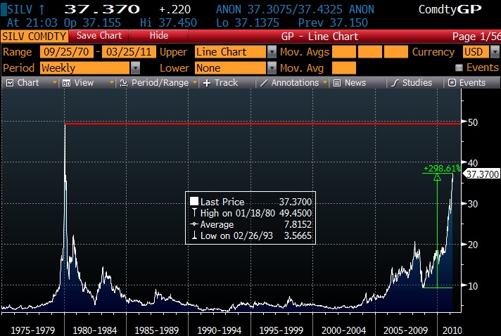
The story of the last few months has been the rise of various commodities, and few have moved as obviously as Silver.  For reference, the peak on the left of the graph is when the Hunt Brothers tried to corner the silver market.   While silver is still short of that peak, and there are valid reasons for holding silver, the speed of the ascent and the psychology that has gone with it makes Our Man think that the time is coming when it’ll be opportune to have some puts on Silver.

 In its latest FedViewspiece, the San Francisco Fed argues that “Global commodity prices have followed economic activity as measured by industrial production”.  That’s a fair enough argument and to back it up they produce this pretty compelling chart:

Case closed! 
 Well, except for one minor thing – those with more skeptical minds might notice that there’s a bit of a scaling issue (i.e. the scales on the 2 y-axes are somewhat different).  What would the chart look like if they axes were scaled similarly?  Furthermore, given industrial production and commodity price data have been around a while, why such a limited historical chart to back up their view?
Thankfully, John Kemp of Reuters had similar questions and saved me an hour in front of Bloomberg this morning by plotting them for us. 


For some reason, these graphs show the linkage is somewhat less clear!  Perhaps the Fed needs to brush-up on its Wall Street-esque marketing techniques

Monday, June 7

Chartology Redux: The latest charts that have caught Our Man’s eye...and why!

1).  The Dollar (as shown by the DXY Index)
How things change!  Three-Six months ago, and the poor old Greenback couldn’t find any friends.  Now it’s threatening its 2008 flight-to-quality highs.   

Why’s it interesting; well, the dollar not been particularly strong for the last 15 years.  Sure in 2000-2002 and 2008 it found a good flight to quality bid, but other than that it’s been pretty weak.  However, for the one other occasion of dollar strength think back to the late 90’s Asian crisis and how it was preceded by a strong dollar rally.

2). M2 and M3 collapsing.
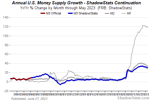
The monetarists amongst us claim that the FED’s money printing ways in 08-09 will inevitably lead to hyperinflation.   Yet, over the last few months, M2 and M3 (as seen below, courtesy of Shadow Stats) have reversed course and are tumbling, in M3’s case at a speed not seen since the 1930’s.
Until we see a pick-up in lending, and the transmission of money from the asset markets to the real economy, we’re going to struggle to see the promised hyper inflation.

 3).  On the negative side, the Consumer Metrics contraction watch, is not pretty.
  
4). Adding to that, the leading indicators are tumbling. 
Given my broad thoughts on some of the lessons we should learn from Japan (here and here), this is a big reason why I have no real interest in adding to my equity exposure (specifically the Water Thesis and the unwritten, so far, Lead-Acid Battery thesis) – I think I’ll be able to get them cheaper.

5).  On the positive side, my favourite up-to-the moment snapshot of the economy, the ADS, shows no signs that its impacting the economy at the moment.  In fact, it suggests thinks are looking quite peachy.

 6). It seems like a long time ago, but we talked about the important of thinking about levels vs. changes
Yes, the changes are dramatic (especially when using year-over-year in a world in flux) and that makes for interesting news-copy and something for talking heads to prattle on about.  But it’s the levels that matter.  In short, it’s fantastic the unemployment claims are down from their peak and that auto sales have risen from their lows but just look at the levels.

(Below, courtesy of Calculated Risk)
I’m not saying that the levels cannot, will not or should not rise from here, indeed they may well.  However, for anyone whose base case is that they will then you’re already pricing in some level of GDP growth as your base case, and your risk management antennae should be well aware of that as more news comes out.

Friday, March 26

Chartology: Some things Our Man's noticed...

Posting has been light recently, with Our Man has been distracted in the last few weeks by securing his permanent good-standing with US Immigration and dusting off his resume for the job-hunt.   However, with the back of that work broken, expect a livelier pace in the coming days/weeks.

As a little taster; here are some charts that Our Man’s keeping his beady eye on 

1) and 2) Some Economic Indicators

Two “Goldilocks” indicators (meaning that 0 = average trend growth) that give a reasonable sense where the economy is.  The first, the Chicago Fed National Activity Index, is based on 85 data series has been useful over its 10yrs in existence, with -0.70 normally being an indication that a recession is heading this way. 


The second, the Auroba-Diebold-Scotti Business Conditions index, is updated daily as new information comes in.  They’re both showing signs of rolling over but neither currently shows a double dip.


3) and 4) Copper

While the S&P has charged ahead since the start of the year Copper’s been left behind and failed to break December’s highs.  Our Man’s also still keeping his beady eye on the LME Warehouse Inventory levels.


5) Shanghai Composite Index
China was the first major market to carve out its bottom back in December 08, and start wandering higher.  It also was the first to peak in August 2009, and the peaks only seem to be getting lower…